A to JazZ Festival — Campaign Characters
Strategy
A to JazZ Festival has been bringing free, open-air jazz to Sofia since 2011, with a dedicated kids programme designed to introduce the youngest audiences to the music. Their mission is to make jazz accessible to everyone and to help people find jazz in themselves. The brief was to build on that spirit and give the festival a more distinct visual personality – one that could draw in families and younger audiences without losing the playful, improvisational energy that jazz is built on. Three animated characters were created to become the face of the campaign, each one as unpredictable and expressive as a live performance.
Design
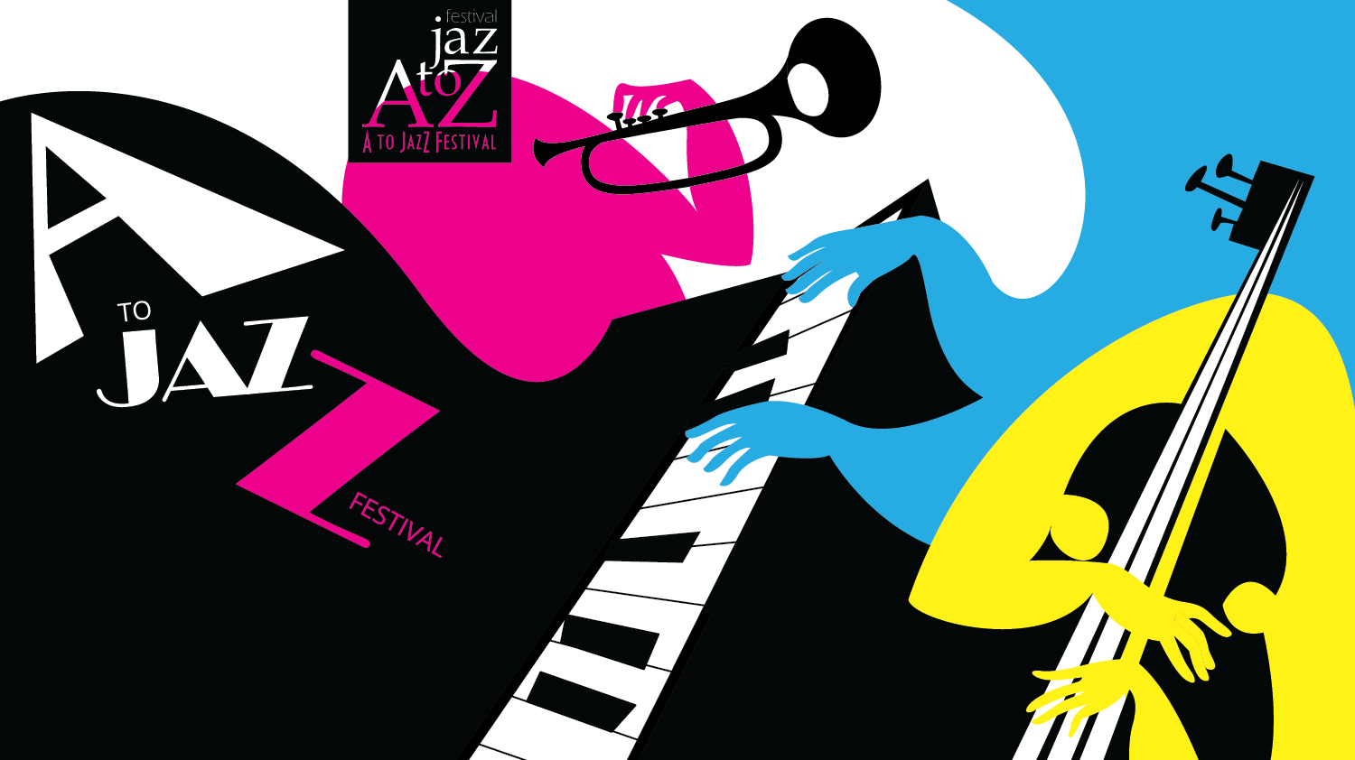
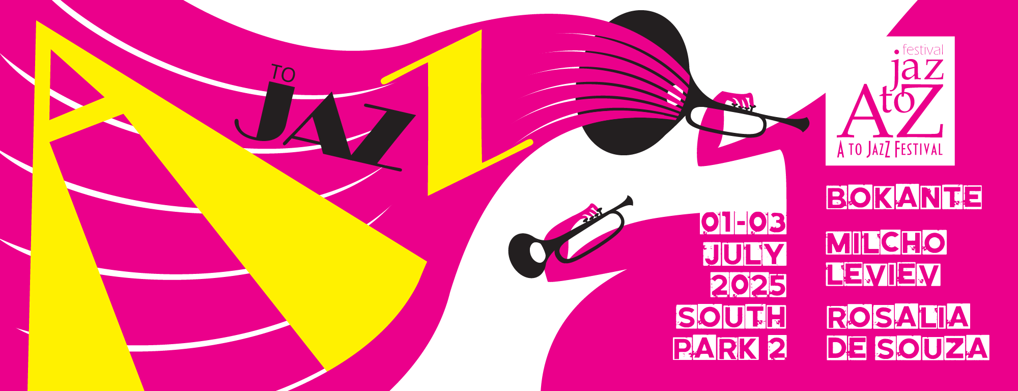
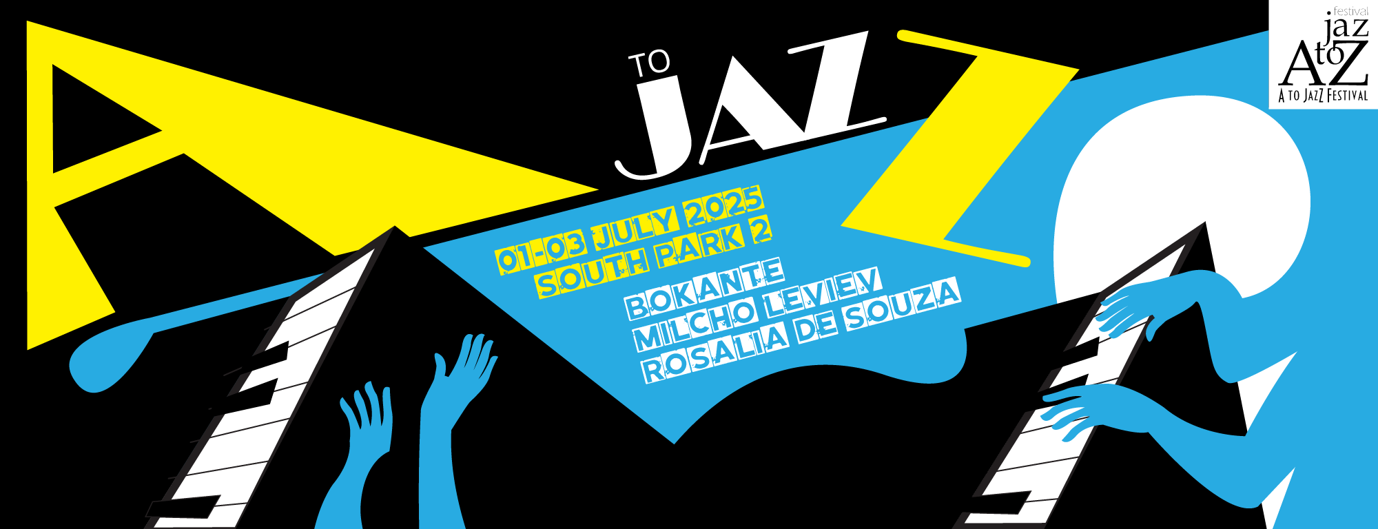
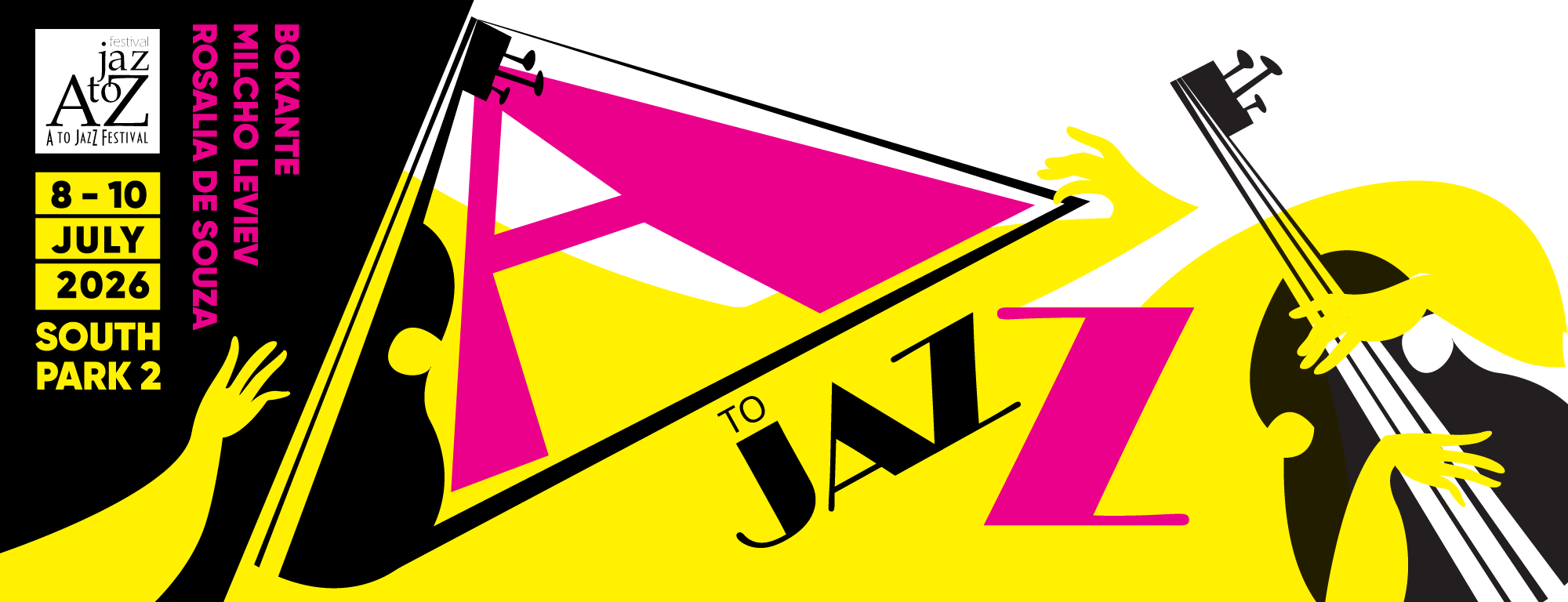
Jazz is loose, spontaneous and full of personality, so the characters had to be too. Each one is an abstract blob in a single bold colour: pink, yellow and blue. They have no rigid anatomy, which means they can bend, stretch and squish freely, as if the music is moving through them. The colour choice was deliberate – primary and joyful, easy for children to latch onto, but graphic enough to hold their own in posters and digital formats. Black is used exclusively for the instruments, grounding each character and making the instrument the one serious thing in the frame. The first character, a headless pink blob playing the trumpet, sets the tone: slightly absurd, completely committed, impossible not to smile at. Two more will follow (yellow on guitar, blue on piano) forming a full band.
Result
The three characters give the festival something it didn’t have before: a cast. Each animation works on its own as a social media post, but together they build a world that feels like the festival itself – colourful, welcoming and a little bit silly. The campaign makes a case that jazz doesn’t have to be intimidating, and that the best seat in the house might just be on a picnic blanket with your kids.